Choosing a book cover is not cosmetic. It is not decoration. It is not a last-minute checkbox before you hit publish. It is a declaration.
I learned that the hard way.
With my previous books, I did what a lot of indie authors do. I uploaded the manuscript to KDP, scrolled through the free templates Amazon offers, picked something that looked decent enough, adjusted a font, maybe nudged the alignment, and called it a day. The book existed. It had a cover. Technically, that was enough to sell it.
But “enough” is not the same thing as intentional.
Those covers weren’t wrong. They just weren’t chosen. They were selected. There’s a difference. Selection is convenience. Choice is identity. And Word Grit demanded a choice.
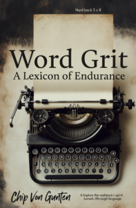
When I first started shaping this book, the working title was Word Grit: A Street Philosophy. That subtitle felt honest. The book does carry a street cadence. It moves like a beat poet arguing with himself at 2 a.m. It has grit in its fingernails. But as the manuscript evolved, something became clearer. This book is about words. Not just attitude. Not just philosophy. Words.
Definitions. Re-definitions. The reclamation of language.
So I changed the subtitle to Word Grit: A Lexicon of Endurance.
That shift mattered. “Street Philosophy” describes a tone. “A Lexicon of Endurance” describes a mission. The book isn’t just commentary. It’s a collection of words reframed through pressure. Each entry dissects language and rebuilds it in the context of depression, doubt, failure, recovery, faith, survival. It’s about finding inner grit through the very words we use to narrate our lives. Once I understood that, the cover had to reflect it.
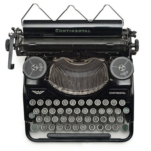
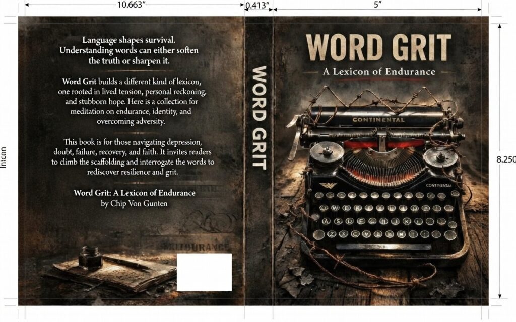
The front image was always going to be a typewriter. An old, classic one. No glowing laptop. No sterile modern minimalism. A typewriter has weight. It has noise. It makes you commit to a sentence. You can’t backspace your way out of responsibility. It represents old school writing. Mechanical truth. Ink striking paper without apology.
My first mockups were simple. A black silhouette of the typewriter against a white background. Clean. Stark. Almost academic. I lived with that version for a while. It worked. It was restrained. It said, “This is a book about writing.”
But it didn’t say why.
After dozens of iterations, tweaks, reworks, scrapped ideas, and late-night second guesses, the final version emerged. The typewriter is now wrapped in barbed wire. There’s a spark of flame rising from the type set.
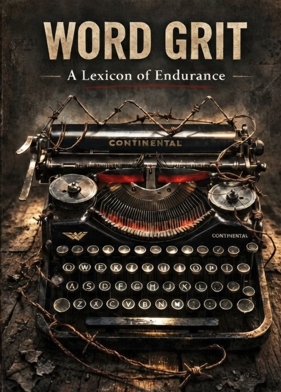
The overall tone leans woody, almost steampunk. Not cartoonish. Not theatrical. Just enough grit in the texture to suggest friction. Because that’s what words are.
Barbed wire represents resistance. Constraint. The way language can trap us. The labels we inherit. The narratives we repeat. The definitions we never question. But the flame at the type set suggests something else. Words can burn through that wire. Words can revolt. A sentence can be a small rebellion. A definition can be a jailbreak.
This book is not about soft affirmations. It’s about interrogating language. It’s about taking a word like failure, depression, faith, identity, and refusing to let the default definition have the final say. The steampunk texture, the grit in the image, the restrained heat of the flame, all of it reflects that tension between confinement and ignition.
The cover needed to feel like a rebel slam against the norm. Because sometimes the words we choose are exactly that.
The back cover matters just as much. It isn’t filler. It’s the contract. It tells the reader what they’re stepping into. The description reads:
“Language shapes survival. Understanding words can either soften the truth or sharpen it. Word Grit builds a different kind of lexicon, one rooted in lived tension, personal reckoning, and stubborn hope. Here is a collection for meditation on endurance, identity, and overcoming adversity. This book is for those navigating depression, doubt, failure, recovery, and faith. It invites readers to climb the scaffolding and interrogate the words to rediscover resilience and grit.”
That paragraph isn’t marketing fluff. It’s the spine of the project. If the front cover is the signal fire, the back cover is the map. It tells you this is not just a collection of poetic definitions. It is a working manual for people in the middle of something hard. For Survivors. Scratched-Up Strivers. Creatives Running on Fumes. Culture Burnouts. People dealing with depression and doubt who are tired of being told to just “stay positive.”
Choosing a cover forced me to clarify what this book actually is.
That’s the hidden gift of the process. A cover exposes vagueness. If you don’t know what your book stands for, your design will look generic. If you’re unsure about your thesis, your typography will hesitate. When you finally get the image right, it’s usually because you’ve finally told yourself the truth about what you wrote.
I may go back and redesign the covers for my earlier books. They deserve that level of attention. But Word Grit needed to be nailed the first time with intention. The subtitle had to be precise. The image had to carry weight. The aesthetic had to reflect friction, endurance, and controlled fire.
A book cover is not a wrapper. It is the first argument your book makes.
Before anyone reads a definition. Before anyone turns a page. Before anyone underlines a sentence.
The cover speaks.
Now that I’ve sent the manuscript & book cover to the printer, we wait. We wait to see what is called a “proof.” The proof will show me if the text and images “fit” inside the printing guidelines. It will be interesting to see this whole idea manifest into something you can hold in your hands.
For Word Grit, I wanted it to say this clearly: words can wound, words can cage, but words can also cut a path out. And sometimes, the most rebellious act is choosing better ones.
